OK-Cancel or Cancel-OK?
Should the OK button come before or after the Cancel button?
Which labeling performs best?

Even I always try to stress out that making the action buttons prominent by giving it more visual weight and a clear and distinct label is more important than its placement. The right placement is super important
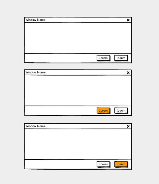
It’s often better to name a button to explain what it does than to use a generic label (like ‘more’, ‘OK’, ‘Yes’ ).
You should use …


Final words about labeling; consistency with platform conventions is another very important aspect to consider when you / we design interaction that is the case regarding to labelings (Microsoft, Apple, Google Android, SAP, … ) but also the next topic the placements of buttons
My answer is in 90% cases that the ‘primary’ buttons work best on the right. And my reason is first of all ‘nobody really reads on the web’ and that’s what I learned and still see in testings – regardless of gender and age or region. People want to scan and go on with their task, process, flow how ever you like to call it.
The area where user are looking for the interaction is in most cases the bottom right area of your page or a section and especially if it is a working environment or a form. It comes on the one hand from how we read in the ‘West’ reading from top to bottom and left to right. And when it comes to the ordering - You can solve this issue by analyzing how the design – the placement of the elements and interactions affects users.
When users find the primary action on the left and then look at the secondary action on the right. Then they’ll move their eyes back to the primary action to click it. This creates a total of three visual fixations in multiple directions. Meaning we force the user to read and not only scan the UI. That might be good – might be bad - but I see it as bad – don’t force your user to anything.
So having the primary action placed on the right and the secondary action placed on the left. Users start with their eyes on the secondary action, and move their eyes to the primary action to click the button. This creates a total of two visual fixations in one direction, giving users a faster visual flow.
Clicking on the secondary action action, in most cases the user expects to change nothing, get back to the former status or take them back to their original screen. Thus, a secondary action or let’s call it (as in most cases the ‘Cancel’ buttons function) behaves like ‘Back’ buttons. And the same with the primary button – the user expects the service, the working tool, the buying or editing process to do the action the button tells her/him and take her/him forward to the next step, screen – further in the process or flow. It’s like how we all would expect it from a pagination buttons’ placement.
Let us give the users a more efficient task flow - A button placed in the right side is easier for users to scan, and to click!
But long story short no rule without exception – as you have seen in my sketches above – there are interfaces where I would turn my own suggestions around.

As Jakob Nielsen once said: “Careful design prevents a problem from occurring in the first place.” We should try to eliminate error-prone conditions which might happen when users accidentally select a wrong option.
Should the OK button come before or after the Cancel button?
Which labeling performs best?

Even I always try to stress out that making the action buttons prominent by giving it more visual weight and a clear and distinct label is more important than its placement. The right placement is super important
Visual weight.
We all know in order to attract attention we or ‘it’ has to ‘shine out’ – it has to be eye-catching. To make clear distinction between two options, we have to emphasize – have to give the primary button a different visual weight. The button with the strongest visual weight will get more attention.
Labeling
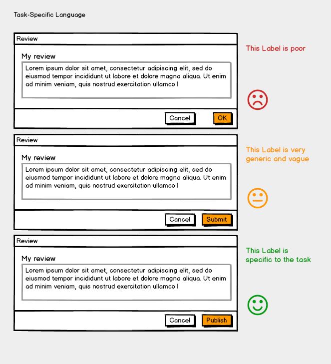
As always in life and clear communication is key. In the real world but as well in the digital world. When we look at a number of actions’ labelings – it again and again not clear and obvious what they will effect or do. When we look at alerts, other overlay modal and dialog boxes it is often critical that the effects and consequences of an action are crystal clear. It’s also about making each option as clear as possible. That’s why it’s so important to have a distinct label for each option.It’s often better to name a button to explain what it does than to use a generic label (like ‘more’, ‘OK’, ‘Yes’ ).
You should use …
- Action Verbs
- Precise Diction - When a primary action is positive e.g. ‘Save’, ‘Send’, ‘Submit’, ‘Publish’ - when the primary action is negative e.g. ‘Delete’, ‘Remove’, ‘Replace’

- Task-Specific Language
- Imperative Form

- Sentence-Style Capitalization

Final words about labeling; consistency with platform conventions is another very important aspect to consider when you / we design interaction that is the case regarding to labelings (Microsoft, Apple, Google Android, SAP, … ) but also the next topic the placements of buttons
Button placement matters
‘OK’/’Cancel’ button debate is very popular among designers: “Should the primary action button come before or after the secondary action button?”My answer is in 90% cases that the ‘primary’ buttons work best on the right. And my reason is first of all ‘nobody really reads on the web’ and that’s what I learned and still see in testings – regardless of gender and age or region. People want to scan and go on with their task, process, flow how ever you like to call it.
The area where user are looking for the interaction is in most cases the bottom right area of your page or a section and especially if it is a working environment or a form. It comes on the one hand from how we read in the ‘West’ reading from top to bottom and left to right. And when it comes to the ordering - You can solve this issue by analyzing how the design – the placement of the elements and interactions affects users.
When users find the primary action on the left and then look at the secondary action on the right. Then they’ll move their eyes back to the primary action to click it. This creates a total of three visual fixations in multiple directions. Meaning we force the user to read and not only scan the UI. That might be good – might be bad - but I see it as bad – don’t force your user to anything.
So having the primary action placed on the right and the secondary action placed on the left. Users start with their eyes on the secondary action, and move their eyes to the primary action to click the button. This creates a total of two visual fixations in one direction, giving users a faster visual flow.
Clicking on the secondary action action, in most cases the user expects to change nothing, get back to the former status or take them back to their original screen. Thus, a secondary action or let’s call it (as in most cases the ‘Cancel’ buttons function) behaves like ‘Back’ buttons. And the same with the primary button – the user expects the service, the working tool, the buying or editing process to do the action the button tells her/him and take her/him forward to the next step, screen – further in the process or flow. It’s like how we all would expect it from a pagination buttons’ placement.
Let us give the users a more efficient task flow - A button placed in the right side is easier for users to scan, and to click!
But long story short no rule without exception – as you have seen in my sketches above – there are interfaces where I would turn my own suggestions around.
As Jakob Nielsen once said: “Careful design prevents a problem from occurring in the first place.” We should try to eliminate error-prone conditions which might happen when users accidentally select a wrong option.
In this context - I like to point you to former articles about form design:
The form of forms … We need them, but also hate them
Form Design - placement on the top or left - left or right aligned
Comments
Post a Comment